thnkrDESIGN AGENCY
← Selected work

BETTR / BRAND IDENTITY & CREATIVE

One idea.
A complete brand.

A sports massage business brought to life through a clear identity, considered print materials and a proposed online presence.

THE BUSINESSBETTR · Sports massage

THE WORKVisual identity · Brand direction · Print design · Website concept

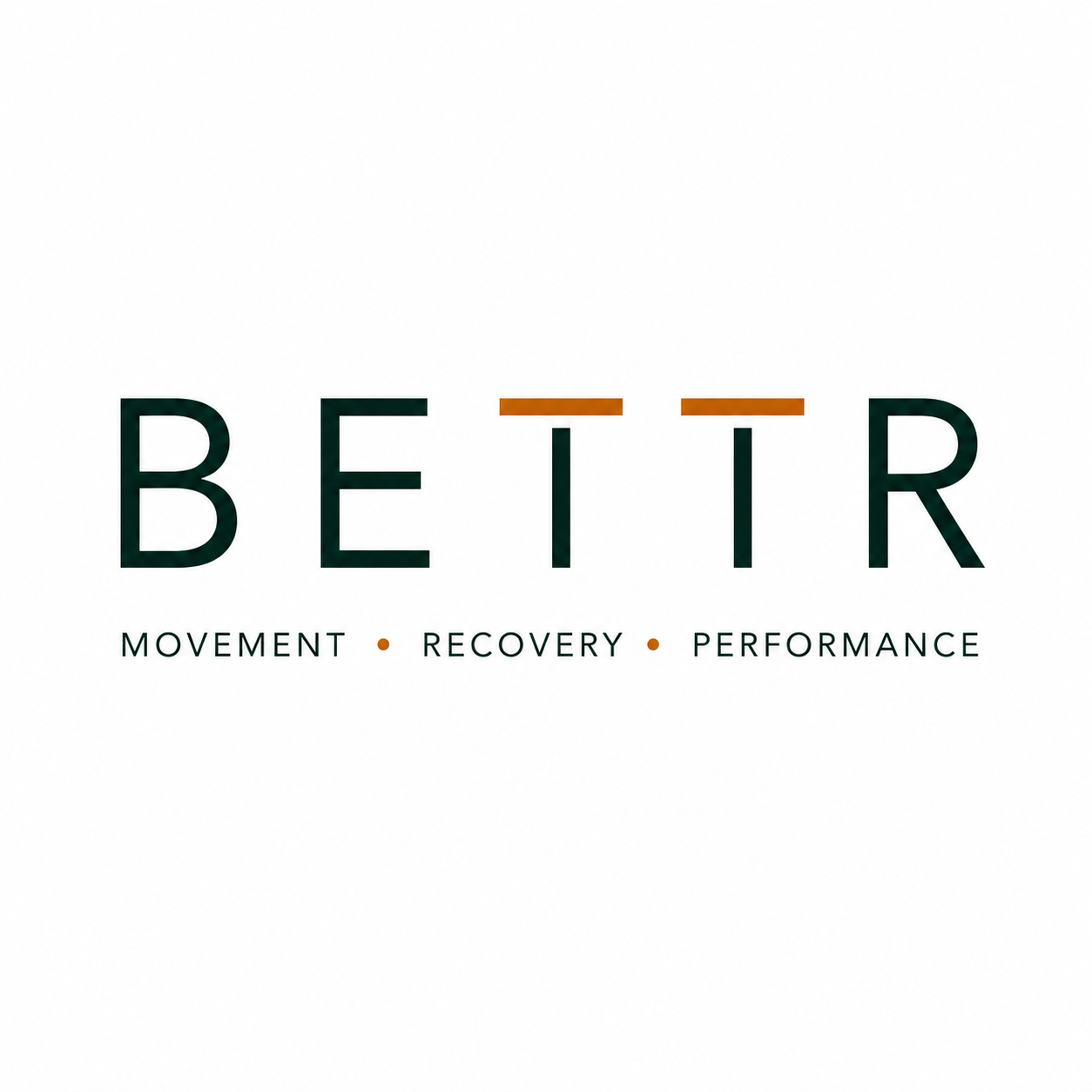
Official BETTR logo with widely spaced white letters and orange bars across the two TsThe official BETTR wordmark

THE THINKING

Everything starts
with the same idea.

BETTR needed an identity that could speak to golfers and active adults, and carry consistently through every part of the business.

The name brings together Build, Evolve, Treat, Thrive and Recover. A spaced wordmark, a restrained natural palette and a clear visual direction connect the brand across its materials.

From the first impression to the everyday details, the aim is a business that feels recognisable wherever people encounter it.

THE VISUAL LANGUAGE

A clear identity.
Room to grow.

Deep green, warm neutrals and bronze accents tie the materials together. Avenir Pro is the type direction documented in the brand guide.

Deep green#0F2823Charcoal#1F1F1FWarm white#F7F6F2Sage#7E8F7BBronze#A8824A

Palette from the existing brand guide. The guide also includes early application concepts.

YOUR IDEA COULD BE NEXT

Something on your mind?

A new business, a new direction or a brand that needs bringing together.

Let’s talk about your idea ↗